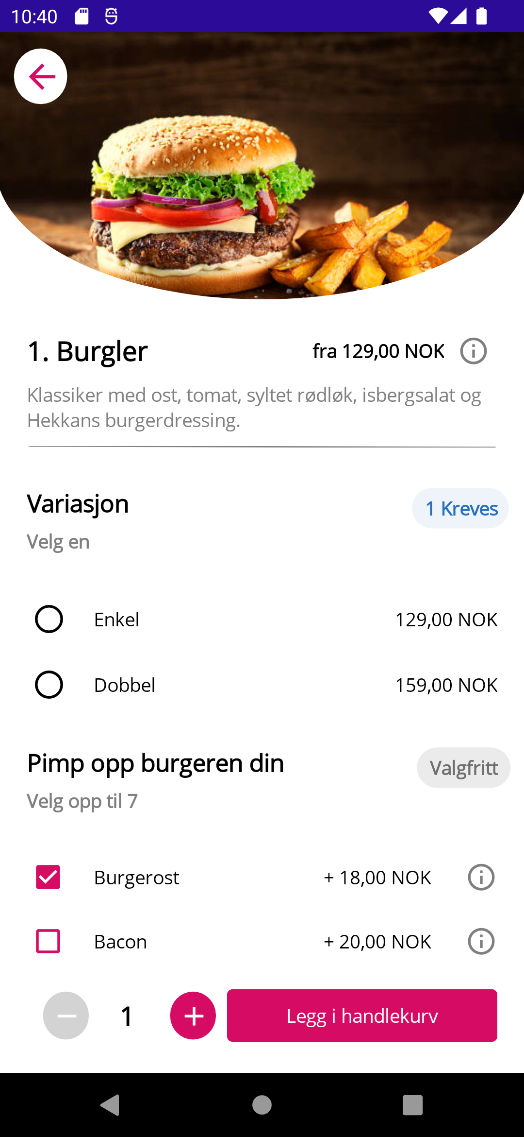
This is the final post in my series of replicating the UI for the Foodora app using .NET MAUI. In this post I’ll replicate the final page, namely the page that shows the details of a specific dish.

Breaking it up
We’ll start by creating some sections:
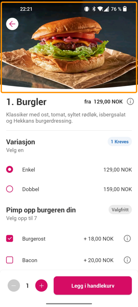
Image section

The image section is pretty identical to the one in my previous post (part 3). The only difference here is that I removed some of the buttons on the right.
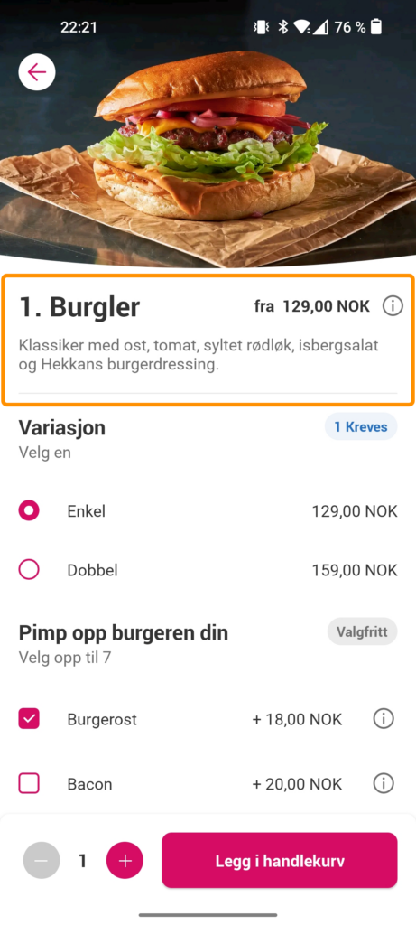
Info section

The info section shows the dish name, price and contents. It also contains a Line, which currently – as of RC1 – has a bug where it won’t show if it’s completely horizontal or vertical. That’s why I set Y2="1", to give it some elevation in order for it to appear. I’ve omitted X1 and Y1, since their default values are zero.
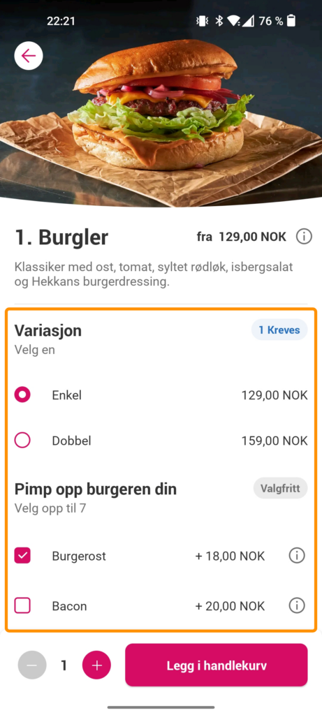
Selection section

The next section is where the user can customize their dish. This section uses both radio buttons and checkboxes. The radio button doesn’t seem to work properly on Android. You can’t click it and you can’t seem to change the color of it, but testing it on Windows shows that you at least can click it there.
Bottom section

The bottom section lets you add the dish to your shopping cart. It also displays the number of dishes you ordered and lets you increase or decrease it. The plus and minus buttons should actually be of type ImageButton, but since it currently has an issue with displaying font icons, I am using Label for purposes of demonstration.
Wrapping up
This concludes my four part series in replicating the Foodora app UI. I’ve learned a lot about .NET MAUI using this method and I hope you have too. It really shows how it’s evolved from Xamarin.Forms and what kind of “shortcuts” you can take now without feeling like you’re doing nasty hacks. The code for all the parts are on my GitHub, so feel free to check out the full sample there. Thanks for sticking through!
