This is a continuation of my Part 1 series of the Xamarin UI Challenge for Cruise Mobile UI. The first part focused on the list page, but this part is going to focus on my implementation of the detail page.
Here’s the design for the detail page from Behance:

And this is my implementation:

I’ll start off by dividing the page into different sections: The carousel, the header, the categories, the description, social and footer/button.
The carousel
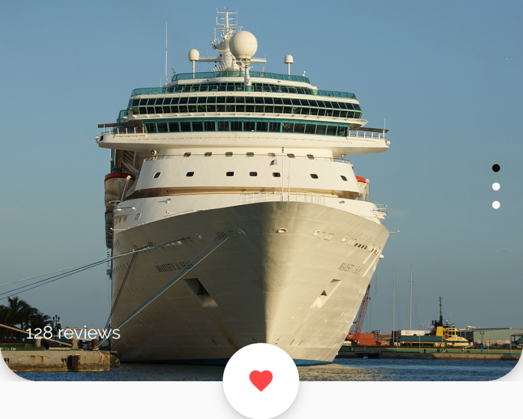
As some of you might notice, my implementation of the carousel does not include the overlapping images. This is mostly because I chose to focus on implementing a functional vertical carousel instead of following the design down to the pixel. I’ll go into detail here of how I did this.
Here I’m using the new CarouselView, which was introduced in Xamarin.Forms 4.4. The first part was to define the CarouselView itself to be at the top of the page. Since there are a lot of overlapping elements in this carousel section I created a Grid with a single row with a height of 300 and placed all the elements in here, including the CarouselView. As I did extensively in the list page, I also used PancakeView here as well. This really shines when you want to set individually rounded corners on an element. Notice that the carousel has two rounded corners at the bottom of the view. I achieved this by wrapping the CarouselView inside a PancakeView.
<Grid>
    <Grid.RowDefinitions>
        <RowDefinition Height="300" />
    </Grid.RowDefinitions>

    <yummy:PancakeView
        CornerRadius="0,0,30,30"
        HasShadow="True"
        HeightRequest="300"
        IsClippedToBounds="True">
        <CarouselView x:Name="imagesCarousel" ItemsSource="{Binding CarouselImages}">
            <CarouselView.ItemsLayout>
                <LinearItemsLayout
                    Orientation="Vertical"
                    SnapPointsAlignment="Start"
                    SnapPointsType="MandatorySingle" />
            </CarouselView.ItemsLayout>
            <d:CarouselView.ItemsSource>
                <x:Array Type="{x:Type models:CarouselImage}">
                    <models:CarouselImage Source="majesty.jpg" />
                    <models:CarouselImage Source="astor.JPG" />
                    <models:CarouselImage Source="mecklenburg.jpg" />
                </x:Array>
            </d:CarouselView.ItemsSource>
            <CarouselView.ItemTemplate>
                <DataTemplate x:DataType="models:CarouselImage">
                    <Image Aspect="AspectFill" HeightRequest="300" Source="{Binding Source}" />
                </DataTemplate>
            </CarouselView.ItemTemplate>
        </CarouselView>
    </yummy:PancakeView>
...
</Grid>
Since the default orientation of a CarouselView is horizontal I had to set the orientation to vertical with the LinearItemsLayout element.
The next step was to add the indicator – the dots that represent which image is being displayed in the carousel. This was done by using the IndicatorView, which was also introduced in Xamarin.Forms 4.4. The IndicatorView was also placed inside the Grid to be able to place it on top of the carousel. My first attempt looked something like this:
<Grid>
    <Grid.RowDefinitions>
        <RowDefinition Height="300" />
    </Grid.RowDefinitions>
    ...
    <IndicatorView
        x:Name="indicatorView"
        Margin="0,125,0,0"
        HeightRequest="50"
        HorizontalOptions="End"
        IndicatorColor="White"
        ItemsSourceBy="imagesCarousel"
        SelectedIndicatorColor="Black"
        VerticalOptions="StartAndExpand" />
    ...
</Grid>
Not exactly what I wanted. Like the design, I wanted the indicators to flow vertically. Sadly this isn’t available (yet?) in Xamarin.Forms, but thanks to some custom renderers I was able to achieve this. First I created a class called VerticalIndicatorView, which inherits from IndicatorView. Then I created the iOS renderer, which looked like this:
[assembly: ExportRenderer(typeof(VerticalIndicatorView), typeof(VerticalIndicatorViewRenderer))]
namespace ItsaMeDesignio.iOS.Renderers
{
    public class VerticalIndicatorViewRenderer : IndicatorViewRenderer
    {
        public VerticalIndicatorViewRenderer()
        {
        }

        protected override void OnElementChanged(ElementChangedEventArgs<IndicatorView> e)
        {
            base.OnElementChanged(e);

            if (Control != null)
            {
                var degrees = 90;
                var rotation = (nfloat)Math.PI * degrees / 180;
                Control.Transform = CGAffineTransform.MakeRotation(rotation);
            }
        }
    }
}
You’ll see from the code that I rotate the indicator 90 degrees to achieve the vertical orientation.
The Android renderer looked like this:
[assembly: ExportRenderer(typeof(VerticalIndicatorView), typeof(VerticalIndicatorViewRenderer))]
namespace ItsaMeDesignio.Droid.Renderers
{
    public class VerticalIndicatorViewRenderer : IndicatorViewRenderer
    {
        public VerticalIndicatorViewRenderer(Context context) : base(context)
        {
            Orientation = Orientation.Vertical;
        }

        protected override void OnElementChanged(ElementChangedEventArgs<IndicatorView> e)
        {
            base.OnElementChanged(e);
        }
    }
}
Here I’m setting the rendered element’s orientation to vertical.
Then, in the XAML page, I switched out the usage of the IndicatorView to the VerticalIndicatorView:
 <customViews:VerticalIndicatorView
                    x:Name="indicatorView"
                    Margin="0,125,0,0"
                    HeightRequest="50"
                    HorizontalOptions="End"
                    IndicatorColor="White"
                    ItemsSourceBy="imagesCarousel"
                    SelectedIndicatorColor="Black"
                    VerticalOptions="StartAndExpand" />
And voilà! I now have a vertical indicator.

Now! Onto the next step: The heart icon. Since this view is round, what kind of view do you think I used here? Yep, you guessed it: PancakeView. I used the MaterialFontFamily like I did in the first post and wrapped this in the PancakeView. The text in the Label is the escaped key for the heart icon.
<yummy:PancakeView
Margin="0,0,0,-30"
BackgroundColor="White"
CornerRadius="30"
HasShadow="True"
HeightRequest="60"
HorizontalOptions="Center"
VerticalOptions="End"
WidthRequest="60">
<Label
x:Name="heartLabel"
FontFamily="{StaticResource MaterialFontFamily}"
FontSize="22"
HorizontalOptions="Center"
Text=""
TextColor="#ff4545"
VerticalOptions="Center" />
</yummy:PancakeView>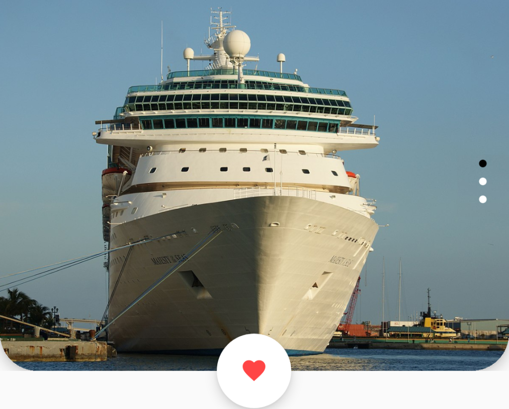
And finally, I added the review text at the bottom left.
<Label
    Margin="20,0,0,30"
    HorizontalOptions="Start"
    Style="{StaticResource textLabel}"
    Text="128 reviews"
    TextColor="White"
    VerticalOptions="End" />
And here it is in motion:

The header

The header is a simple layout with some text using both the styles headerLabel and textLabel.
<StackLayout Margin="20">
    <Label
        FontSize="26"
        Style="{StaticResource headerLabel}"
        Text="Discover the" />
    <Label
        Margin="0,0,0,40"
        FontSize="16"
        Style="{StaticResource textLabel}"
        Text="World of Viking Cruises" />
    ...
</StackLayout>
The categories
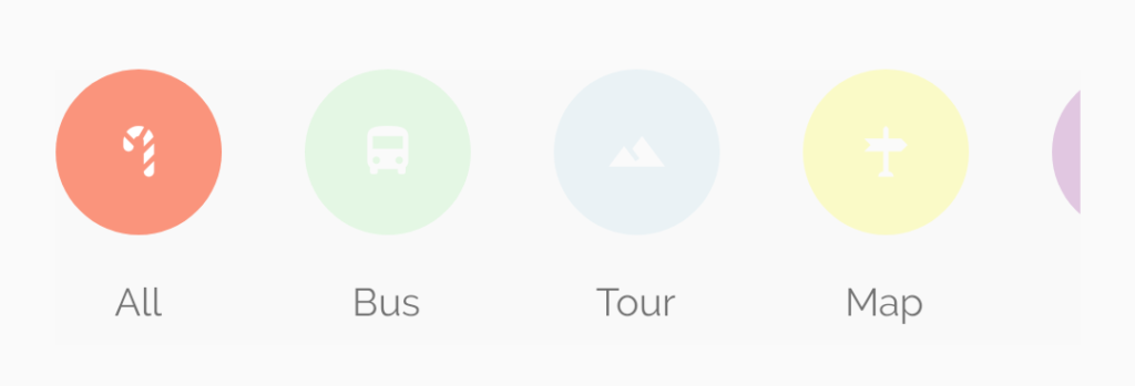
The categories section is defined as a horizontal CollectionView with some hard-coded items. The item layout uses the PancakeView to create a circle with an icon inside it, just like with the heart icon in the carousel. The first item is set with full opacity while the rest of the items are set with an opacity of 0.2. A label is placed under the circle.
<CollectionView HeightRequest="100" ItemsSource="{Binding Categories}">
    <CollectionView.ItemsLayout>
        <LinearItemsLayout ItemSpacing="30" Orientation="Horizontal" />
    </CollectionView.ItemsLayout>

    <CollectionView.ItemTemplate>
        <DataTemplate x:DataType="models:Category">
            <StackLayout>
                <yummy:PancakeView
                    BackgroundColor="{Binding Color}"
                    CornerRadius="30"
                    HeightRequest="60"
                    Opacity="{Binding Opacity}"
                    WidthRequest="60">
                    <Label
                        FontFamily="{StaticResource MaterialFontFamily}"
                        FontSize="22"
                        HorizontalOptions="Center"
                        Text="{Binding Icon}"
                        TextColor="White"
                        VerticalOptions="Center" />
                    <yummy:PancakeView.GestureRecognizers>
                        <TapGestureRecognizer Tapped="TapGestureRecognizer_Tapped_1" />
                    </yummy:PancakeView.GestureRecognizers>
                </yummy:PancakeView>
                <Label
                    Margin="0,10,0,0"
                    HorizontalOptions="Center"
                    Style="{StaticResource textLabel}"
                    Text="{Binding Text}" />
            </StackLayout>
        </DataTemplate>
    </CollectionView.ItemTemplate>
</CollectionView>
From the design I made the assumption that the categories are clickable and that’s why I added the TapGestureRecognizer. This sets the opacity of the clicked category to full (1) and sets the previously selected category to an opacity of 0.2.

private async void TapGestureRecognizer_Tapped_1(object sender, EventArgs e)
{
    var item = sender as PancakeView;

    if (previouslySelectedCategory != null)
        await previouslySelectedCategory.FadeTo(0.2, 100);
    await item.FadeTo(1, 400, Easing.SpringOut);

    previouslySelectedCategory = item;
}
The description

The description section is comprised a label with some FormattedText to mix the two font types.
<Label Margin="0,20,0,0" FontSize="16" LineHeight="2">
    <Label.FormattedText>
        <FormattedString>
            <Span FontSize="16" Style="{StaticResource headerLabel}" Text="Best of Italy" />
            <Span FontSize="16" Style="{StaticResource textLabel}" Text=" (16 destinations) includes accommodation as well as an expert guide, meails, transport and more." />
        </FormattedString>
    </Label.FormattedText>
</Label>
The social section

The social section consists of three parts: icons, favorites and comments. I started off with defining a grid that would contain these parts:
<Grid>
    <Grid.RowDefinitions>
        <RowDefinition Height="100" />
    </Grid.RowDefinitions>
    <Grid.ColumnDefinitions>
        <ColumnDefinition Width="2*" />
        <ColumnDefinition Width="1*" />
        <ColumnDefinition Width="1*" />
    </Grid.ColumnDefinitions>
...
</Grid>
Using the grid trick for overlapping elements (and using the same technique as for the profile icon in part 1 of this blog post) I added several elements in the same grid column and shifted each one slightly to the right. I did this by tweaking the left margin. That way it looks like each icon is taking a “bite” out of the other.
<yummy:PancakeView Style="{StaticResource personCircle}">
    <Image Aspect="AspectFill" Source="profilepic" />
</yummy:PancakeView>
<yummy:PancakeView Margin="38,0,0,0" Style="{StaticResource personCircle}">
    <Image Aspect="AspectFill" Source="profilepic" />
</yummy:PancakeView>
<yummy:PancakeView Margin="76,0,0,0" Style="{StaticResource personCircle}">
    <Image Aspect="AspectFill" Source="profilepic" />
</yummy:PancakeView>
<yummy:PancakeView Margin="114,0,0,0" Style="{StaticResource personCircle}">
    <Image Aspect="AspectFill" Source="profilepic" />
</yummy:PancakeView>
Both the favorites and comments part are using the same “pill style” as used in part 1 of this blog post, only here some of the colors and icons are different.
<yummy:PancakeView
Grid.Column="1"
Padding="5"
BackgroundColor="LightGoldenrodYellow"
CornerRadius="15"
HorizontalOptions="EndAndExpand"
VerticalOptions="Center">
<StackLayout
HorizontalOptions="Center"
Orientation="Horizontal"
VerticalOptions="Center">
<Label
FontFamily="{StaticResource MaterialFontFamily}"
FontSize="20"
Text=""
TextColor="Red" />
<Label
FontSize="16"
Style="{StaticResource textLabel}"
Text="+178"
TextColor="Red" />
</StackLayout>
</yummy:PancakeView>
<yummy:PancakeView
Grid.Column="2"
Padding="5"
BackgroundColor="LightGoldenrodYellow"
CornerRadius="15"
HorizontalOptions="EndAndExpand"
VerticalOptions="Center">
<StackLayout
HorizontalOptions="Center"
Orientation="Horizontal"
VerticalOptions="Center">
<Label
FontFamily="{StaticResource MaterialFontFamily}"
FontSize="20"
Text=""
TextColor="Cyan" />
<Label
FontSize="16"
Style="{StaticResource textLabel}"
Text="14"
TextColor="Cyan" />
</StackLayout>
</yummy:PancakeView>Bottom button

The button on the bottom is just a simple button with some rounded corners. Behind the scenes I am using an implicit style here to set the font family of all the buttons in the app to the Raleway font which I am using for the labels by using global styles.
<Button
    Padding="20"
    BackgroundColor="#fa947c"
    CornerRadius="25"
    Text="Book a tour"
    TextColor="White" />
Wrapping up
Well, this post ended up being far longer than I expected. If you made it this far: Congratulations! Anyhow…
I had a lot of fun doing this UI challenge. It forced me to think in ways I rarely do usually and it made me want to replicate the design as much as I could without taking too many shortcuts. I would recommend everyone to try it out and I bet you’ll learn a new trick or two.
Oh, and also, Hot Reload and the Xamarin.Forms Previewer were really helpful when trying to iterate on a design like this. Having a picture of the design open on one screen and the editor and an emulator on the other screen really made this a fun challenge.
I hope you got inspired by this too, and if you did, check out some mobile designs on Behance or Dribbble and have at it!
Edit: I forgot to mention that I added the code up on Snppts. You can find it here.

Great job !!! One of the best UI articles I have read and was waiting with anticipation for Part #2 …
Great Post Andreas!
I know you have mentioned that you will not focus on actual design by the pixel, however what are your thoughts on implementing scrolling like in original?
Any thoughts on how to achieve that?
Best,
Danil
Thanks, Danil!
Do you mean implementing scrolling on the entire page? I did that, I might have forgotten to mention it in the blog post. If you wanna check out the source code you can see it here: https://github.com/andreas-nesheim/CruiseMobileUI
thanks for that, is there an option to do the “The social section” section with the overlapping images with a bindable collection of images?
I’m pretty sure that would be doable. You could create a bindable horizontal StackLayout for example with each element having a negative left margin to achieve the overlap.
Man, great