Usually when I create apps I tend to focus on the functionality or the problem I am trying to solve. The design usually takes a back seat during this prosess. I was inspired by Kym Philpotts and his Xamarin.Forms UI challenges, so I decided to try it out myself to put design in the driver’s seat for once. This was also a great opportunity for me to test out frameworks and methods I’ve been hearing about for a while.
I checked out some designs on Behance and found this beautiful design Cruise Mobile UI made by Tamo Miqeladze. I figured I would focus on two views from this design: the list page and the detail page.
This blog post will be split up into two parts, with this one focusing on the list page and the second one focusing on the detail page.
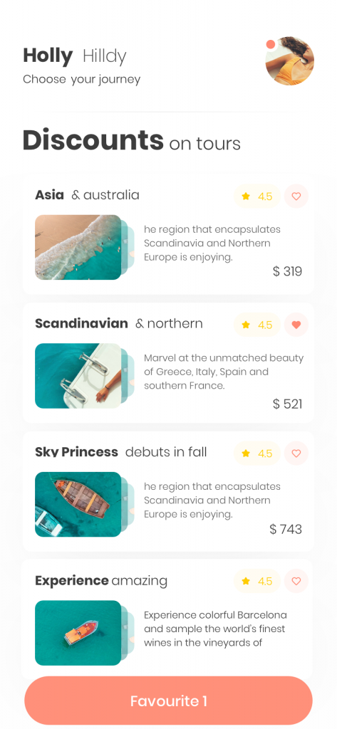
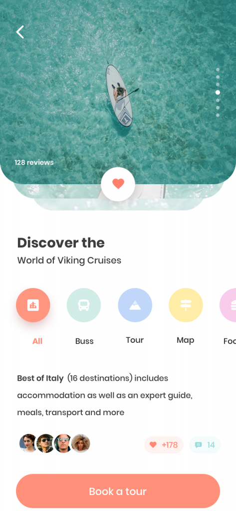
App resources
The first thing I noticed was that the default system text wouldn’t cut it here, so I searched Google Fonts for something that would match. I went with Raleway and included two different styles: one light and one bold. I defined them both as label styles in App.xaml with the bold one named headerLabel and the light one named textLabel.
I also noticed that the design contains a lot of icons. I’ve been meaning to test out font icons for a while, so I decided to follow this guide by James Montemagno and add the Material icons to the app and use them.
List page
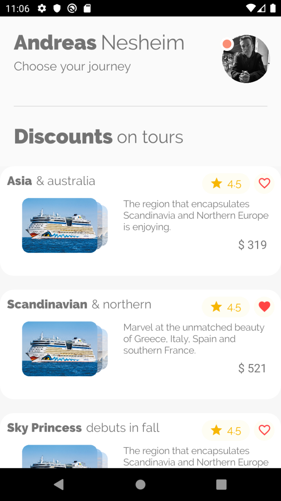
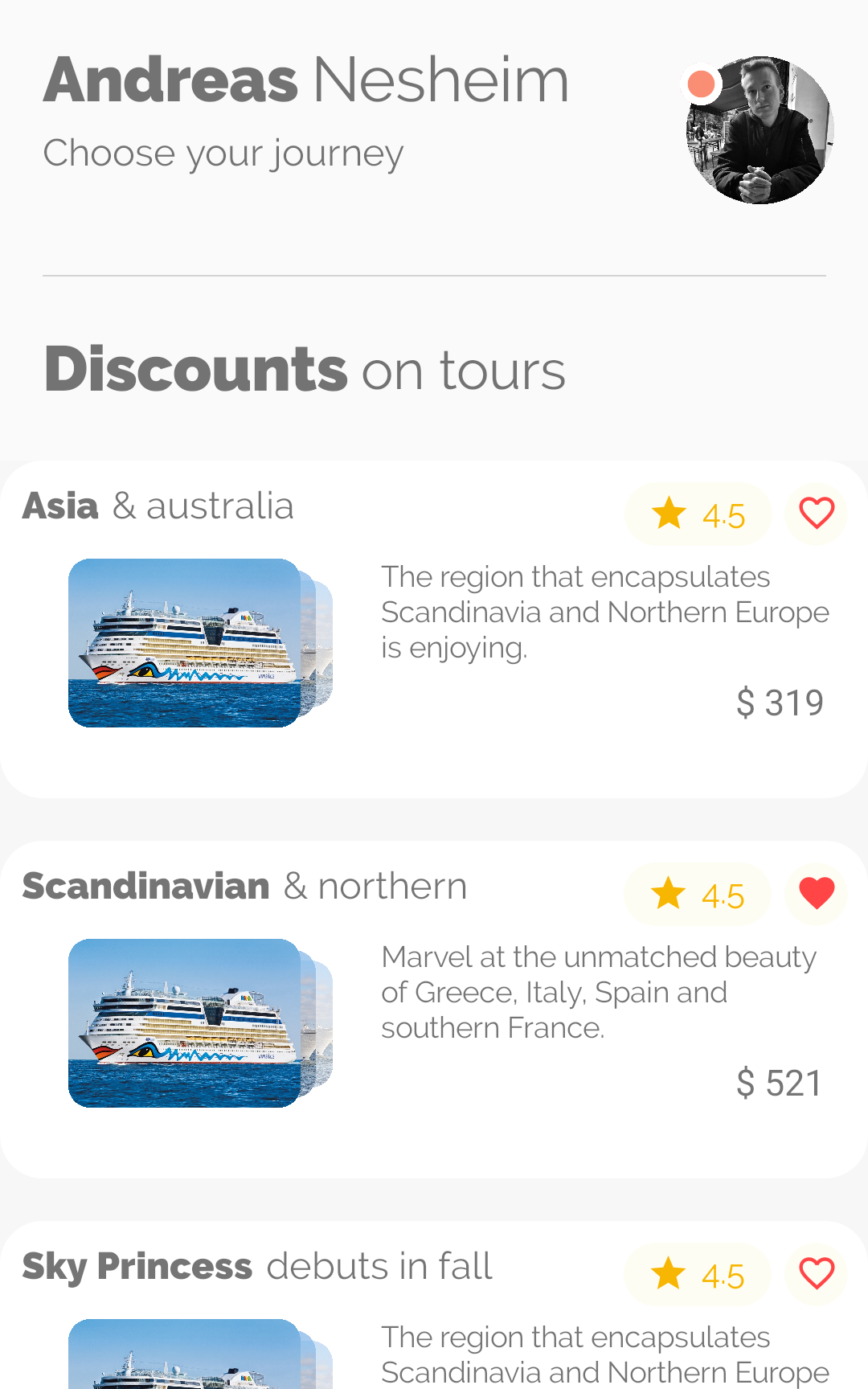
My final implemented page looks like this. So first let’s start off by breaking the list page into three sections: The header, the subheader and the list.
The header

I started off by creating a grid with two columns – one for the text and one for the profile icon.
<Grid HeightRequest="200">
            <Grid.ColumnDefinitions>
                <ColumnDefinition Width="3*" />
                <ColumnDefinition Width="*" />
            </Grid.ColumnDefinitions>
...
</Grid>
The text in the first column is a combination of horizontal and vertical stack layouts:
<StackLayout Grid.Column="0" Margin="20">
    <StackLayout Orientation="Horizontal">
        <Label FontSize="30" Style="{StaticResource headerLabel}" Text="Andreas" />
        <Label FontSize="30" Style="{StaticResource textLabel}" Text="Nesheim" />
    </StackLayout>
    <Label FontSize="18" Style="{StaticResource textLabel}" Text="Choose your journey" />
</StackLayout>
The profile icon is created using PancakeView. This is to easily create a round view, no matter what the content is. The PancakeView is referenced with the yummy namespace, which is declared at the top of the page file:
xmlns:yummy="clr-namespace:Xamarin.Forms.PancakeView;assembly=Xamarin.Forms.PancakeView"The profile icon is defined as such:
<yummy:PancakeView
                Grid.Column="1"
                CornerRadius="35"
                HeightRequest="70"
                HorizontalOptions="Center"
                IsClippedToBounds="True"
                VerticalOptions="Center"
                WidthRequest="70">
                <Image Aspect="AspectFill" Source="profilepic" />
</yummy:PancakeView>
Notice that to make the view circular I’ve set the CornerRadius to half of the WidthRequest and HeightRequest.
The little orange “status” icon at the top left of the profile icon is sort of taking a chunk out of the profile picture. This was done by adding the status icon in the same grid column as the profile picture. This way we can create overlapping layouts.
The status icon is also a PancakeView and is defined as such:
<yummy:PancakeView
                Grid.Column="1"
                Margin="12,30,0,0"
                BackgroundColor="#fa8e75"
                BorderColor="White"
                BorderThickness="7"
                CornerRadius="10"
                HeightRequest="20"
                HorizontalOptions="Start"
                VerticalOptions="Start"
                WidthRequest="20" />
This could also probably be achieved with a BoxView, but I went with PancakeView since I wanted to play around with it.
To get the “padding” around the orange bit we add a BorderThickness of 7 and set the BorderColor to white. I played around with the margins until I got the positioning somewhat right.
The complete layout with the profile icon and the status ball looks like this:
 <yummy:PancakeView
                Grid.Column="1"
                CornerRadius="35"
                HeightRequest="70"
                HorizontalOptions="Center"
                IsClippedToBounds="True"
                VerticalOptions="Center"
                WidthRequest="70">
                <Image Aspect="AspectFill" Source="profilepic" />
            </yummy:PancakeView>
 <yummy:PancakeView
                Grid.Column="1"
                Margin="12,30,0,0"
                BackgroundColor="#fa8e75"
                BorderColor="White"
                BorderThickness="7"
                CornerRadius="10"
                HeightRequest="20"
                HorizontalOptions="Start"
                VerticalOptions="Start"
                WidthRequest="20" />
Note that they’re both added to the same grid column. When adding elements to the same column or row, the order of the elements in the XAML defines the Z-index. So in this case, the status icon will appear on top of the profile picture.
The subheader

The subheader is a setup of a separator line and some text:
<BoxView Margin="20,0" BackgroundColor="LightGray" HeightRequest="0.5" />
<StackLayout Margin="20" Orientation="Horizontal">
    <Label FontSize="30" Style="{StaticResource headerLabel}" Text="Discounts" />
    <Label Margin="0,3,0,0" FontSize="26" Style="{StaticResource textLabel}" Text="on tours" />
</StackLayout>
The separator is defined with a BoxView with a HeightRequest of 0.5.
The list
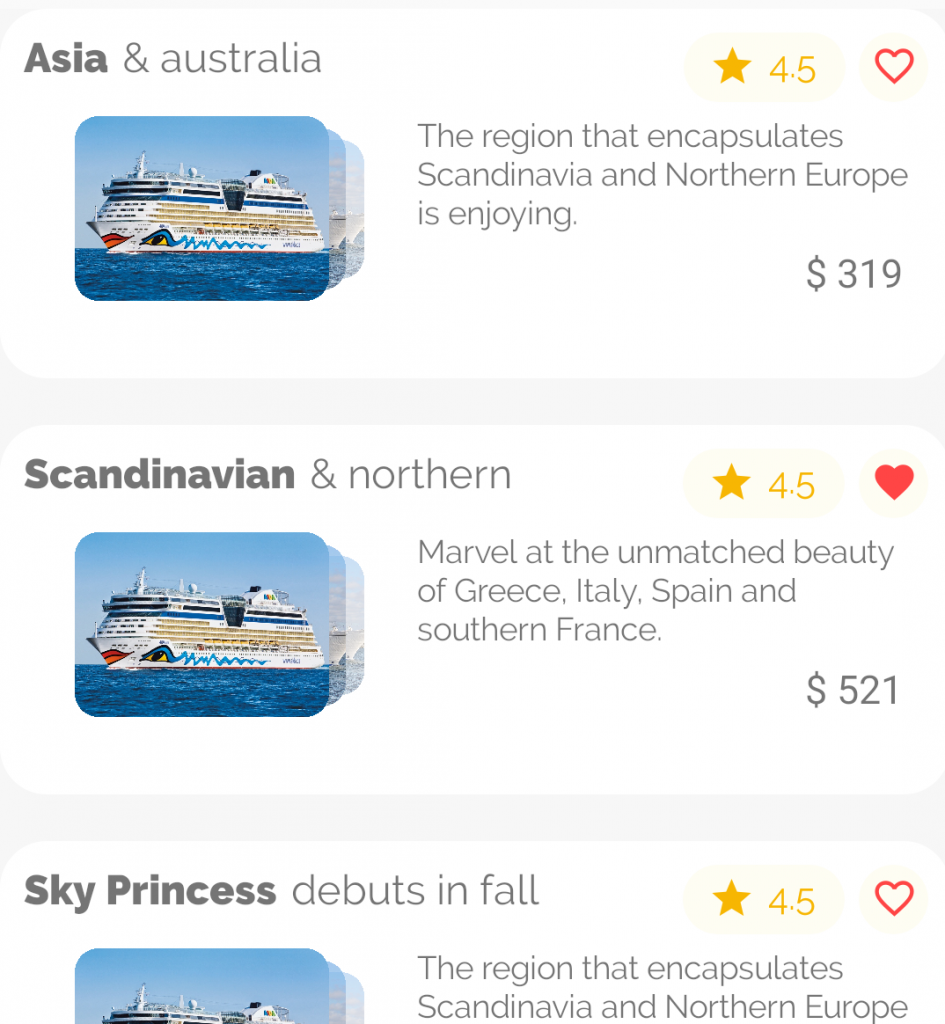
There’s a lot of things going on in this item template for this list. Let’s try to break it down by starting with the top-level container for the item template.
Top-level
<yummy:PancakeView
    Margin="10"
    Padding="10"
    BackgroundColor="White"
    CornerRadius="20"
    HeightRequest="120"
    HorizontalOptions="FillAndExpand">
...
</yummy:PancakeView>
I’m using a PancakeView here as well just to easily get the rounded corners.
Title and icons
Next I added a horizontal StackLayout that would fit the title text and the icons (the star rating and the heart). I started out with the text first:
<StackLayout Orientation="Horizontal">
    <Label
        FontSize="18"
        LineBreakMode="NoWrap"
        Style="{StaticResource headerLabel}"
        Text="{Binding Text}" />
    <Label
        FontSize="18"
        LineBreakMode="NoWrap"
        Style="{StaticResource textLabel}"
        Text="{Binding Subtitle}" />
    ...
</StackLayout>
Both the star rating and the heart icon are wrapped in a sort of “pill style”, which is defined with a PancakeView. Let’s start with how that looks for the star rating:
<yummy:PancakeView BackgroundColor="#fefdf3" CornerRadius="15" HeightRequest="30" HorizontalOptions="EndAndExpand" WidthRequest="70">
...
</yummy:PancakeView>
Inside of this I added a horizontal StackLayout containing the icon and the star rating text:
<StackLayout HorizontalOptions="Center" Orientation="Horizontal" VerticalOptions="Center">
<Label FontFamily="{StaticResource MaterialFontFamily}" FontSize="20" Text="" TextColor="#f7b602" />
<Label FontSize="16" Style="{StaticResource textLabel}" Text="4.5" TextColor="#f7b602" />
</StackLayout>Notice that I’m referencing MaterialFontFamily, as described in the guide I linked to earlier. The text refers to the escaped key of the star icon.
I do somewhat of the same for the heart icon:
<yummy:PancakeView BackgroundColor="#fefdf3" CornerRadius="15" HeightRequest="30" WidthRequest="30">
    <Label
        FontFamily="{StaticResource MaterialFontFamily}"
        FontSize="20"
        HorizontalOptions="Center"
        Text="{Binding Icon}"
        TextColor="#ff4545"
        VerticalOptions="Center" />
</yummy:PancakeView>
Here I’m binding the text to the viewmodel property Icon. This is to toggle wether the icon should be a filled heart or a outlined heart.
Image and description
Next we move on to the image and the description. I defined a grid with two columns to hold the image and the description:
<Grid>
    <Grid.ColumnDefinitions>
        <ColumnDefinition Width="2*" />
        <ColumnDefinition Width="3*" />
    </Grid.ColumnDefinitions>
...
</Grid>
To create the overlapping effect of the images I am utilizing the Grid as I did earlier with the profile icon. I’m adding three images with some minor differences:
<yummy:PancakeView
    Margin="50,0,0,0"
    CornerRadius="10"
    HeightRequest="60"
    HorizontalOptions="Center"
    Opacity="0.4"
    VerticalOptions="Center"
    WidthRequest="90">
    <Image Aspect="AspectFill" Source="majesty.jpg" />
</yummy:PancakeView>
<yummy:PancakeView
    Margin="25,0,0,0"
    CornerRadius="10"
    HeightRequest="70"
    HorizontalOptions="Center"
    Opacity="0.7"
    VerticalOptions="Center"
    WidthRequest="100">
    <Image Aspect="AspectFill" Source="astor.jpg" />
</yummy:PancakeView>
<yummy:PancakeView
    CornerRadius="10"
    HeightRequest="80"
    HorizontalOptions="Center"
    Opacity="1"
    VerticalOptions="Center"
    WidthRequest="110">
    <Image Aspect="AspectFill" Source="aidaluna.jpg" />
</yummy:PancakeView>
The top image is full-sized with full opacity (1). The second image is scaled a bit down, shifted to the right (with margins) and the opacity is set down to 0.7. The third image is scaled even more down, shifted more to the right and the opacity is set to 0.4. Notice that the same applies here: The order of the elements in the XAML defines the Z-index.
The description text and the price are both labels that are placed in the second column of the grid:
<Label
    Grid.Column="1"
    Margin="10,0,0,0"
    FontSize="14"
    LineBreakMode="WordWrap"
    Style="{StaticResource textLabel}"
    Text="{Binding Description}" />
<Label
    Grid.Column="1"
    Margin="0,0,10,0"
    FontSize="17"
    HorizontalOptions="End"
    Text="{Binding Price, StringFormat='$ {0:}'}"
    VerticalOptions="End" />
Wrapping up
This concludes the first part of the design challenge. As I stated above, the next part will be focusing on the detail page, which was actually my inspiration for making this blog post.
Awesome job !!! Can’t wait for part 2 …